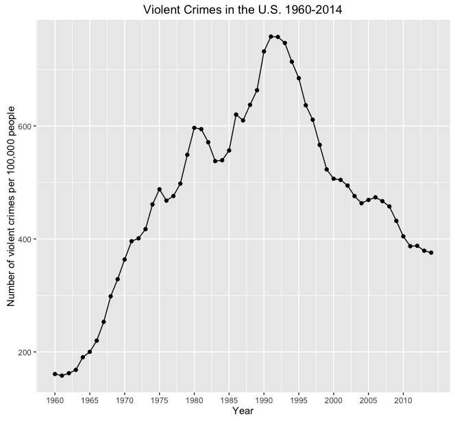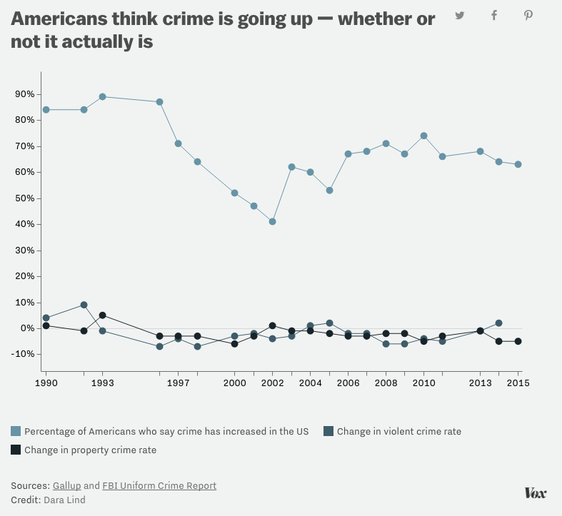
Consider the following terrible visualization:

Here are some serious problems with the presentation of data here:
- Having a statistic hovering around at around 10 times the differences of the important numbers makes them look small and insignificant.
- One scale applies to percentage of the population and another to year over year change.